|
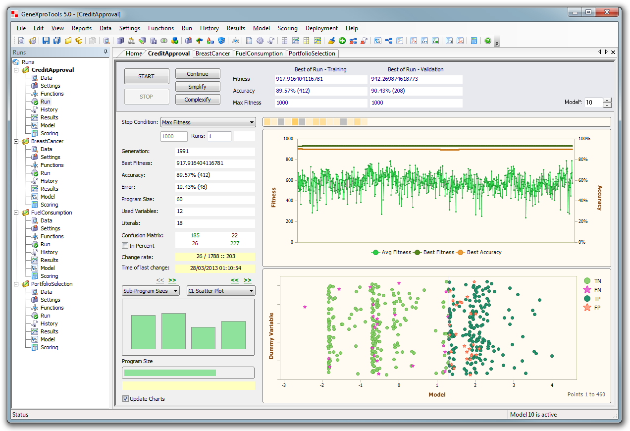
Run Panel - Classification
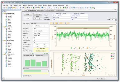
It's at the Run Panel that models are designed and
visualized.
This image shows the new sophisticated Classification Scatter Plot in action.
|
|
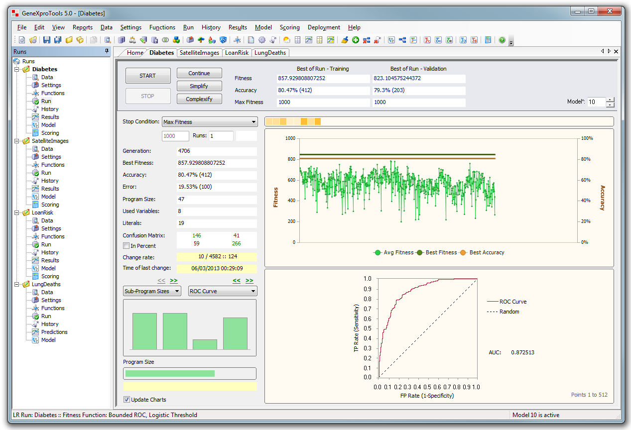
Run Panel - Logistic Regression
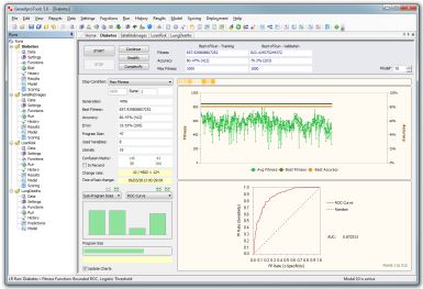
New ROC Curve available during model design, both in
Classification & Logistic Regression.
|
|
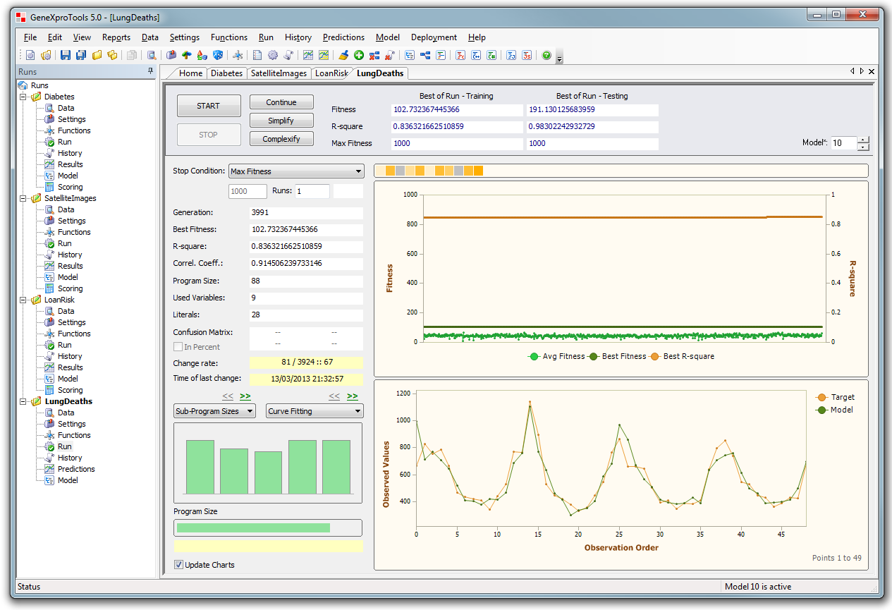
Run Panel - Time Series
Prediction
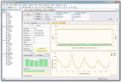
Run Panel in
Time Series Prediction with the Curve Fitting Chart at the bottom
right.
|
|
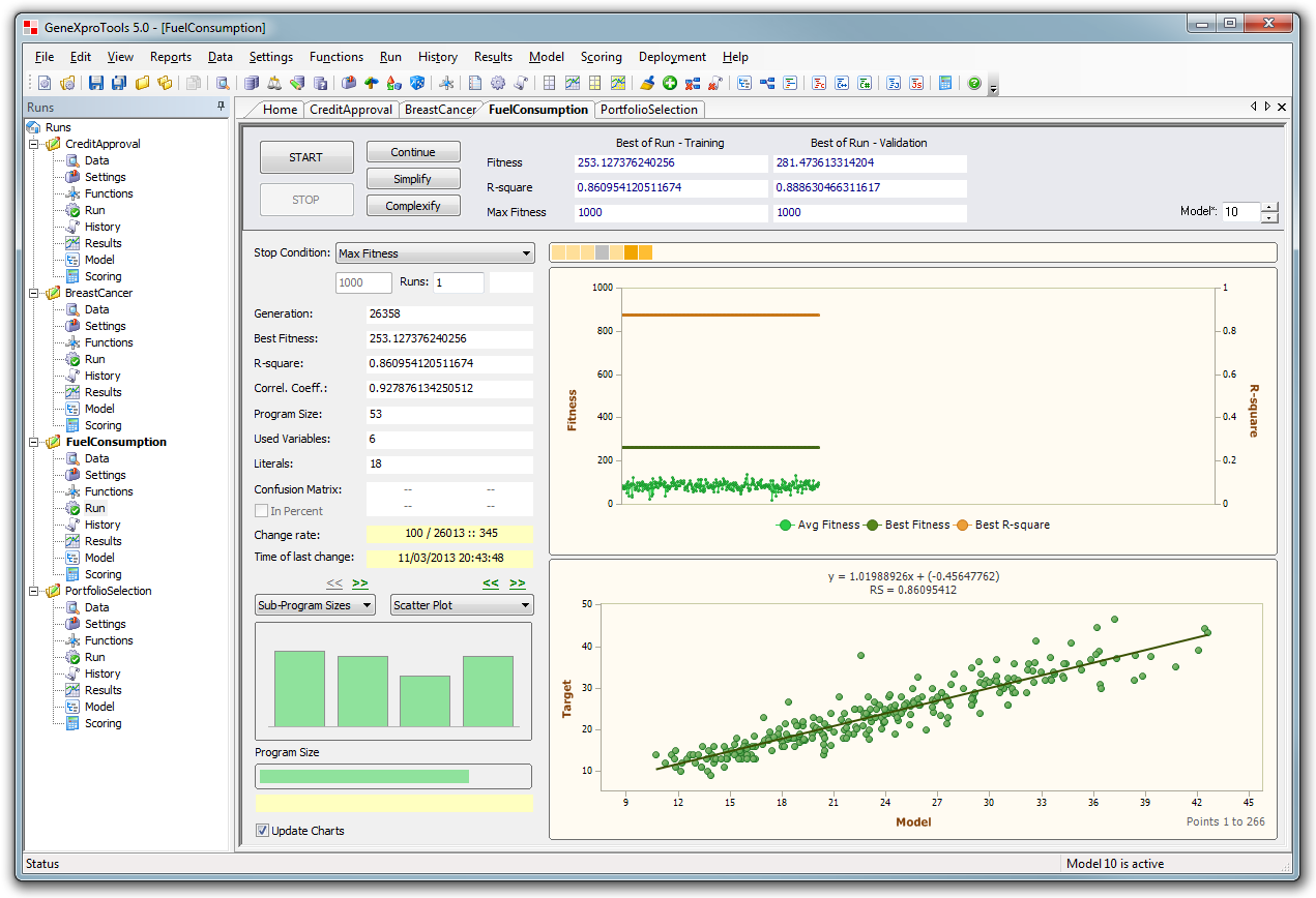
Run Panel - Regression
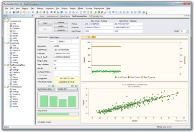
Regression and Time Series Prediction share the same
curve fitting charts for model design.
This image shows the newly introduced Scatter Plot.
|
|
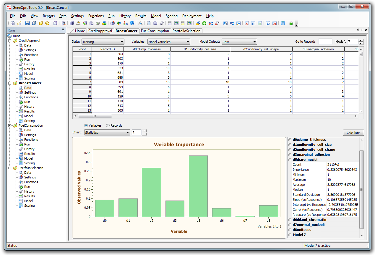
Data Panel
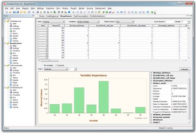
New Variable Importance Chart and variable statistics.
|
|
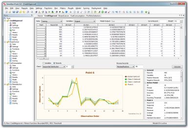
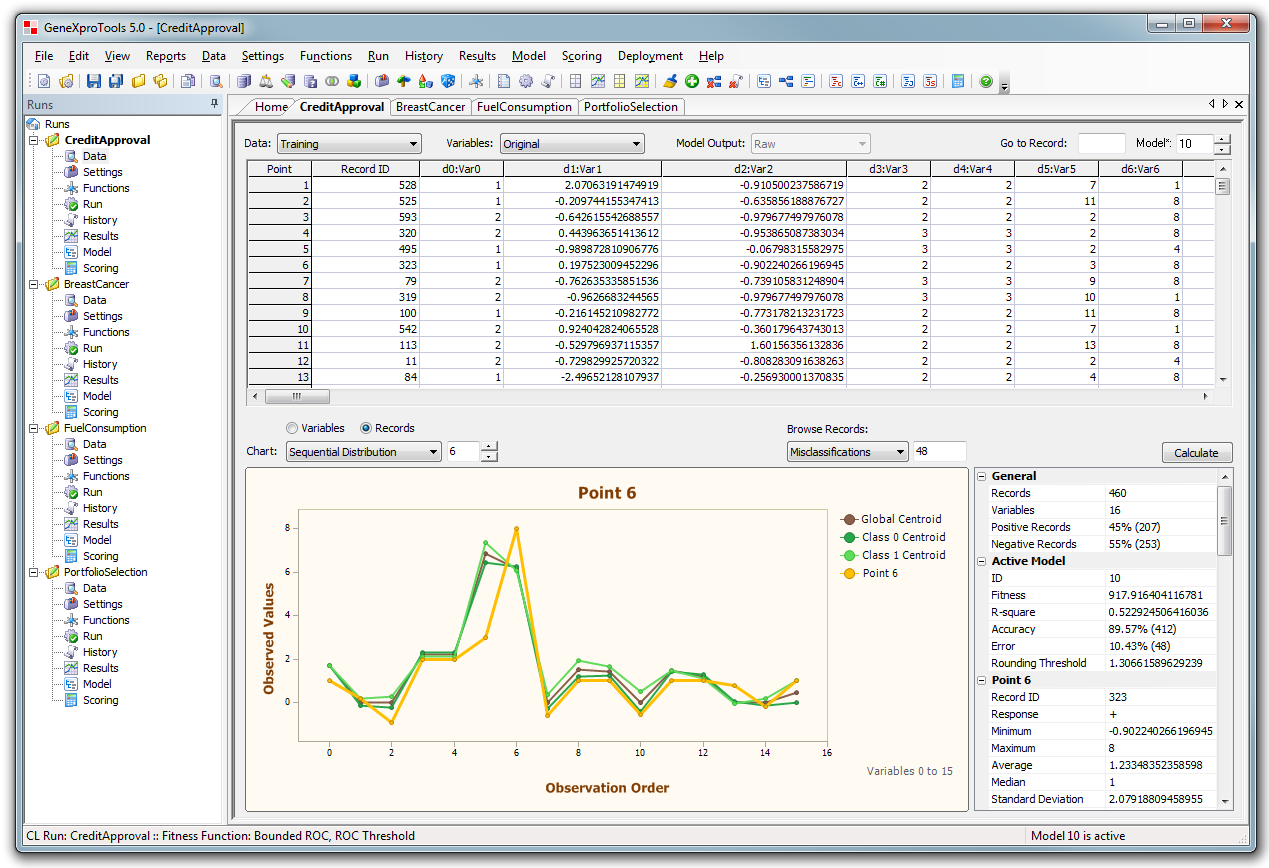
Error analysis by browsing misclassified records one by one.
|
|
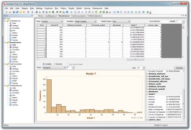
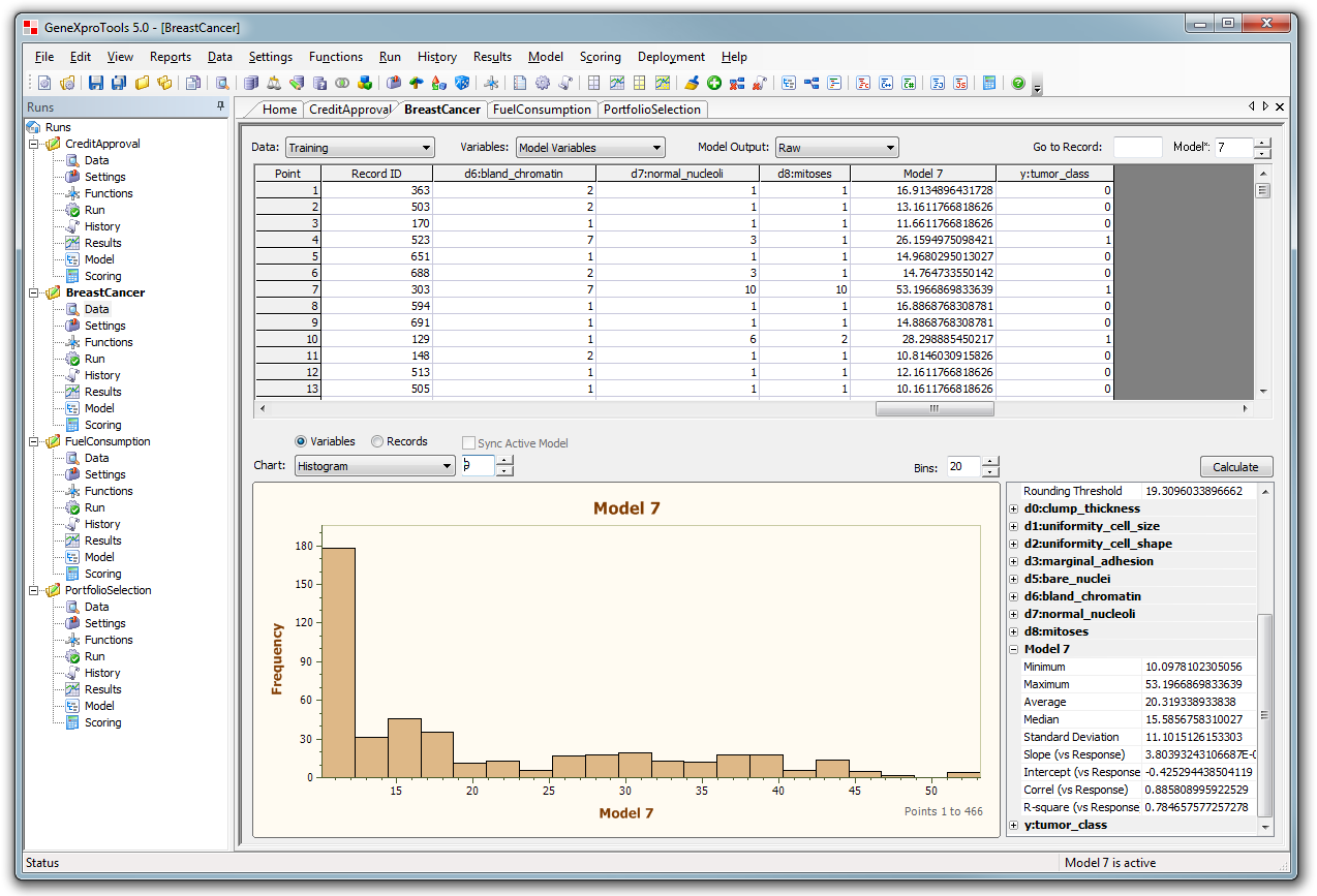
Analyze the Histograms of all variables and all the models of the run.
|
|
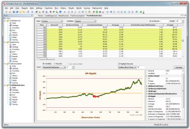
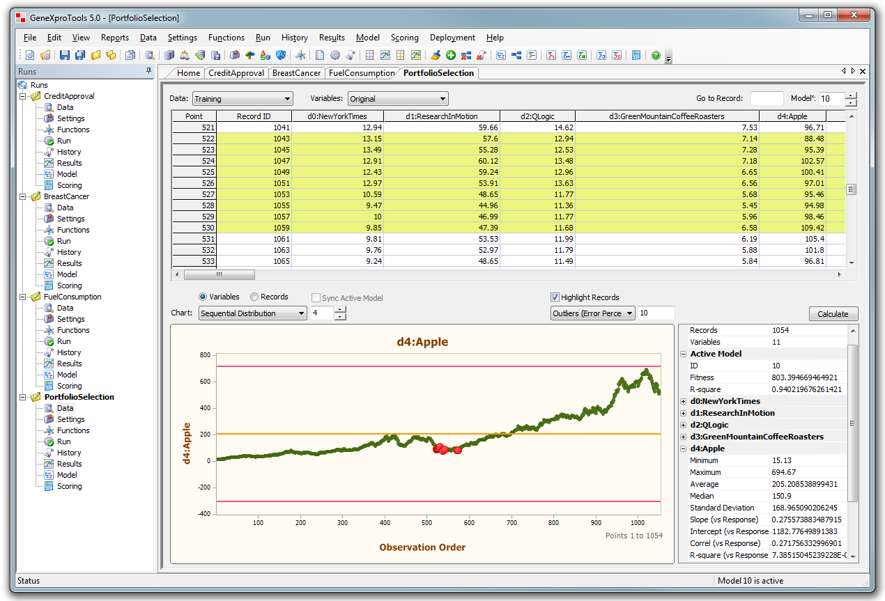
Easily find model outliers. Note that they are highlighted both
in the chart and in the grid.
|
|
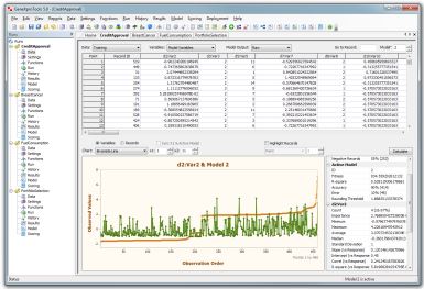
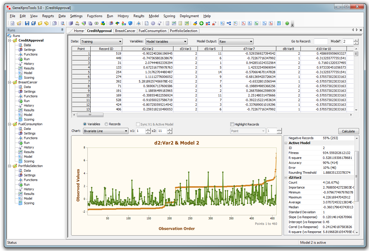
New Bivariate Line Chart for comparing and analyzing
any pair of variables.
|
|
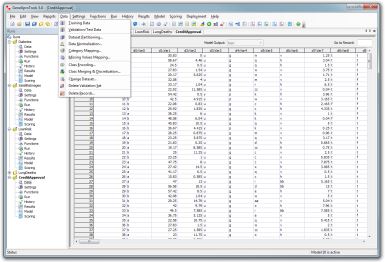
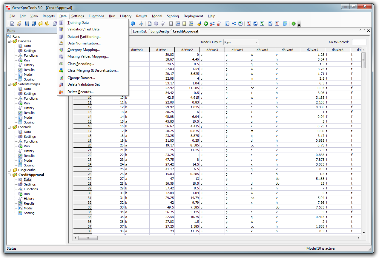
New data management tools for dataset partitioning
and transformation.
|
|
Settings Panel
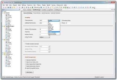
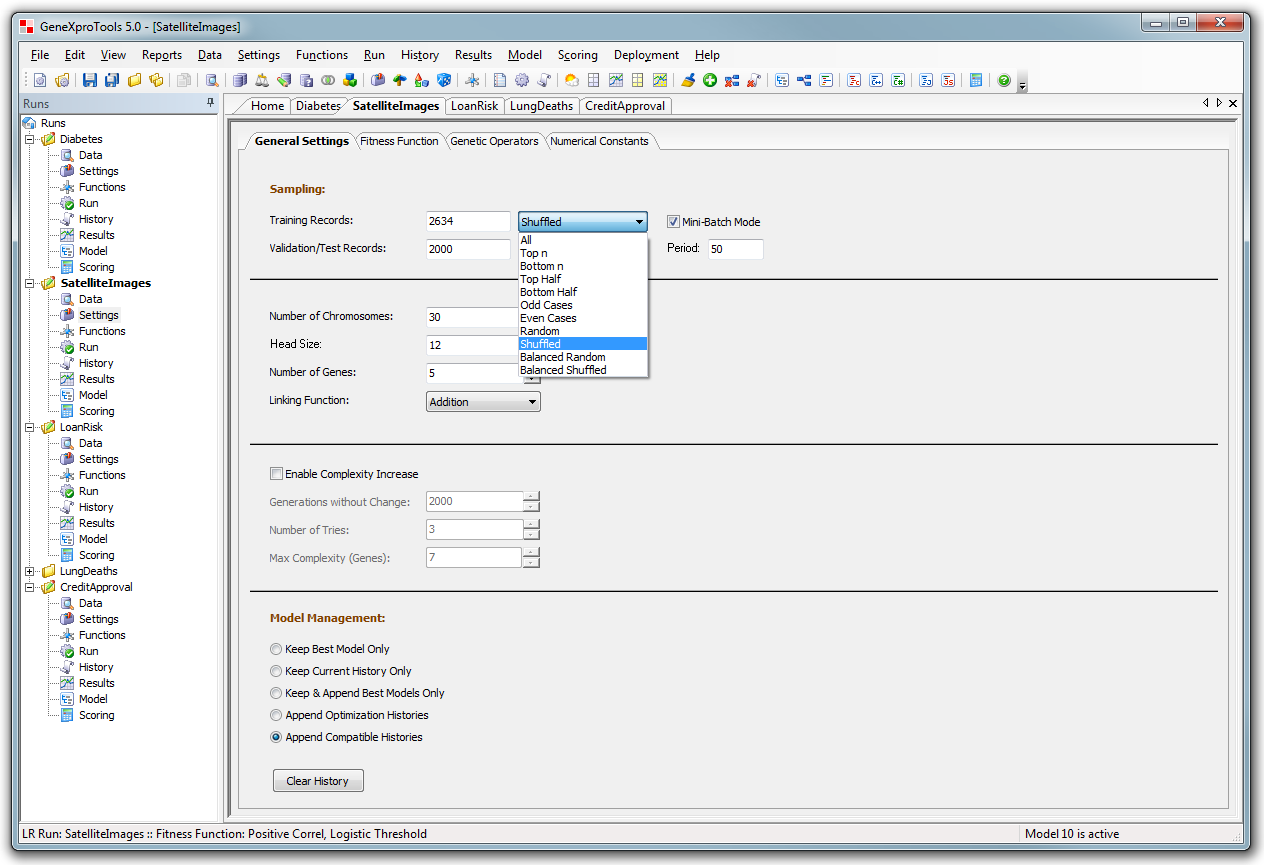
Several sampling schemes including bagging and mini-batch
mode.
|
|
Functions Panel
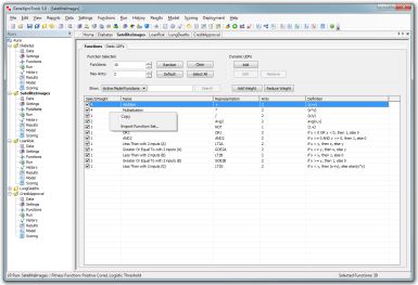
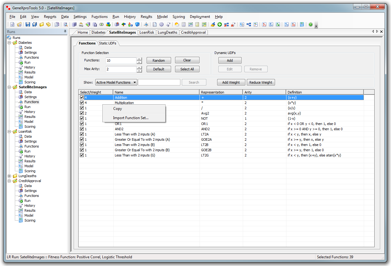
This is the function management screen with new
tools for function set selection,
including a new feature to import function sets and
custom functions from other Runs.
|
|
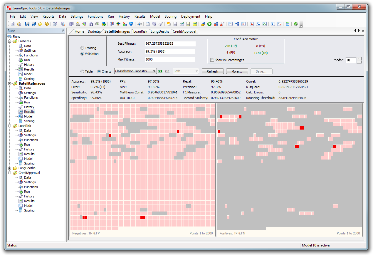
Results Panel - Classification
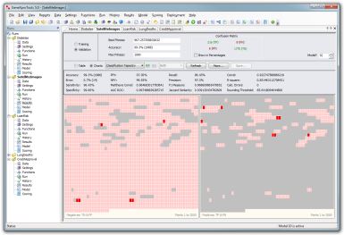
In the Results Panel you have access to the
Classification Tapestry both in
Logistic Regression and Classification. Note the extended statistics at the top.
|
|
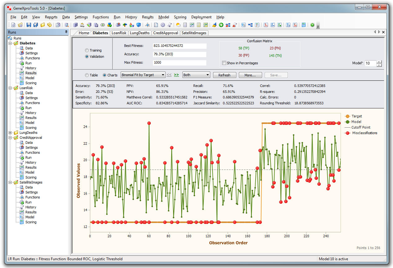
Results Panel - Logistic Regression
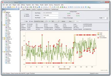
Binomial Fit Chart sorted by target, showing the Rounding Threshold
and highlighting
the misclassifications. It's available both for
logistic regression and classification models. |
|
|
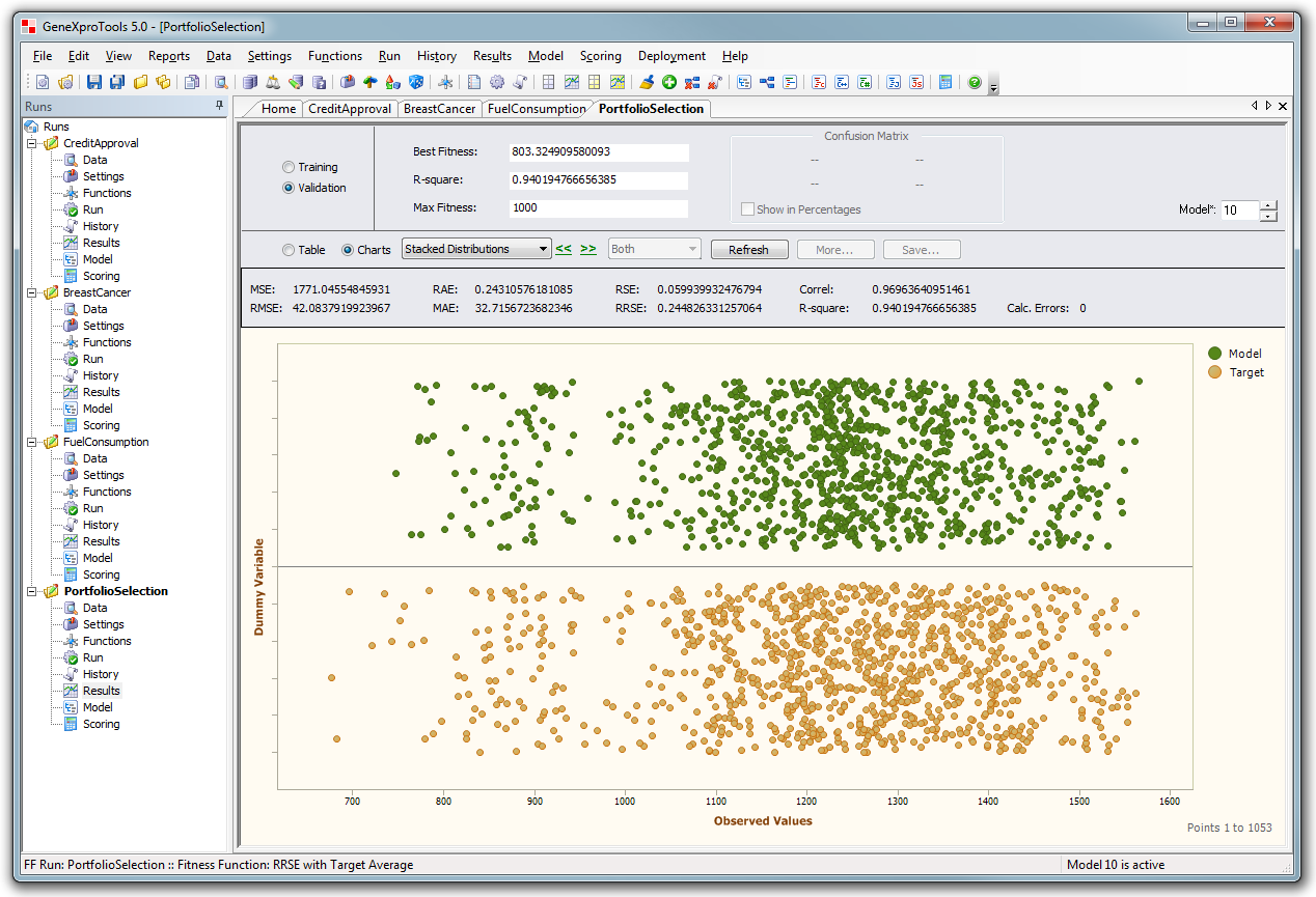
Results Panel - Regression
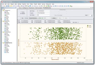
In the Results Panel of Function Finding additional charts
and statistics
are available for model evaluation and testing.
|
|
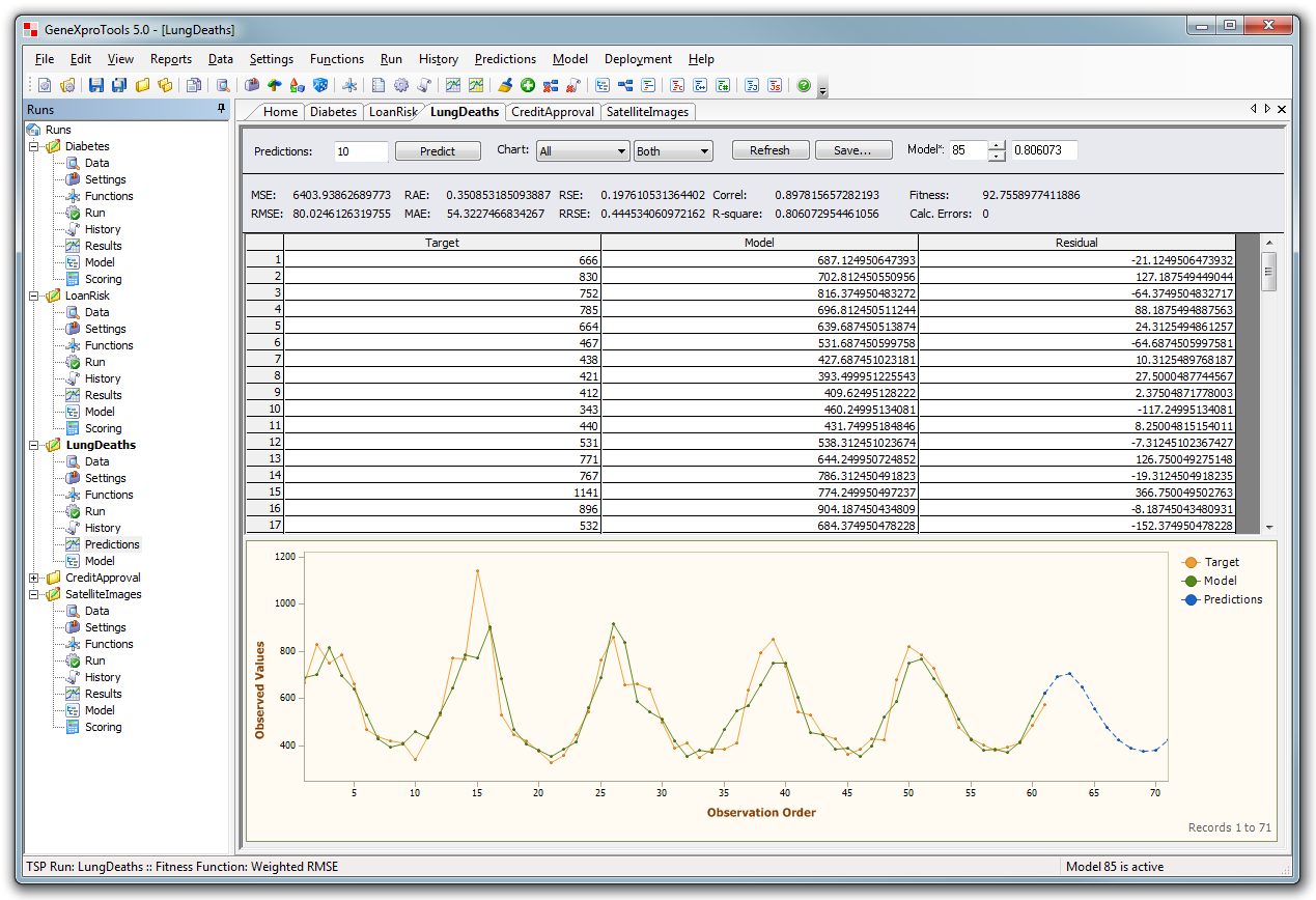
Predictions Panel - Time Series Prediction
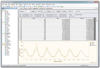
Time Series Prediction runs have a dedicated panel to make predictions. In the
picture above the chart shows the predictions using a blue dashed line.
|
|
History Panel
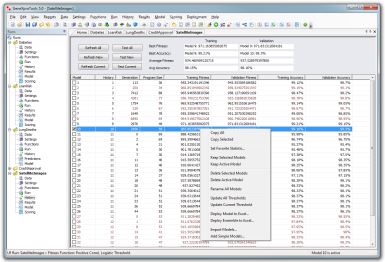
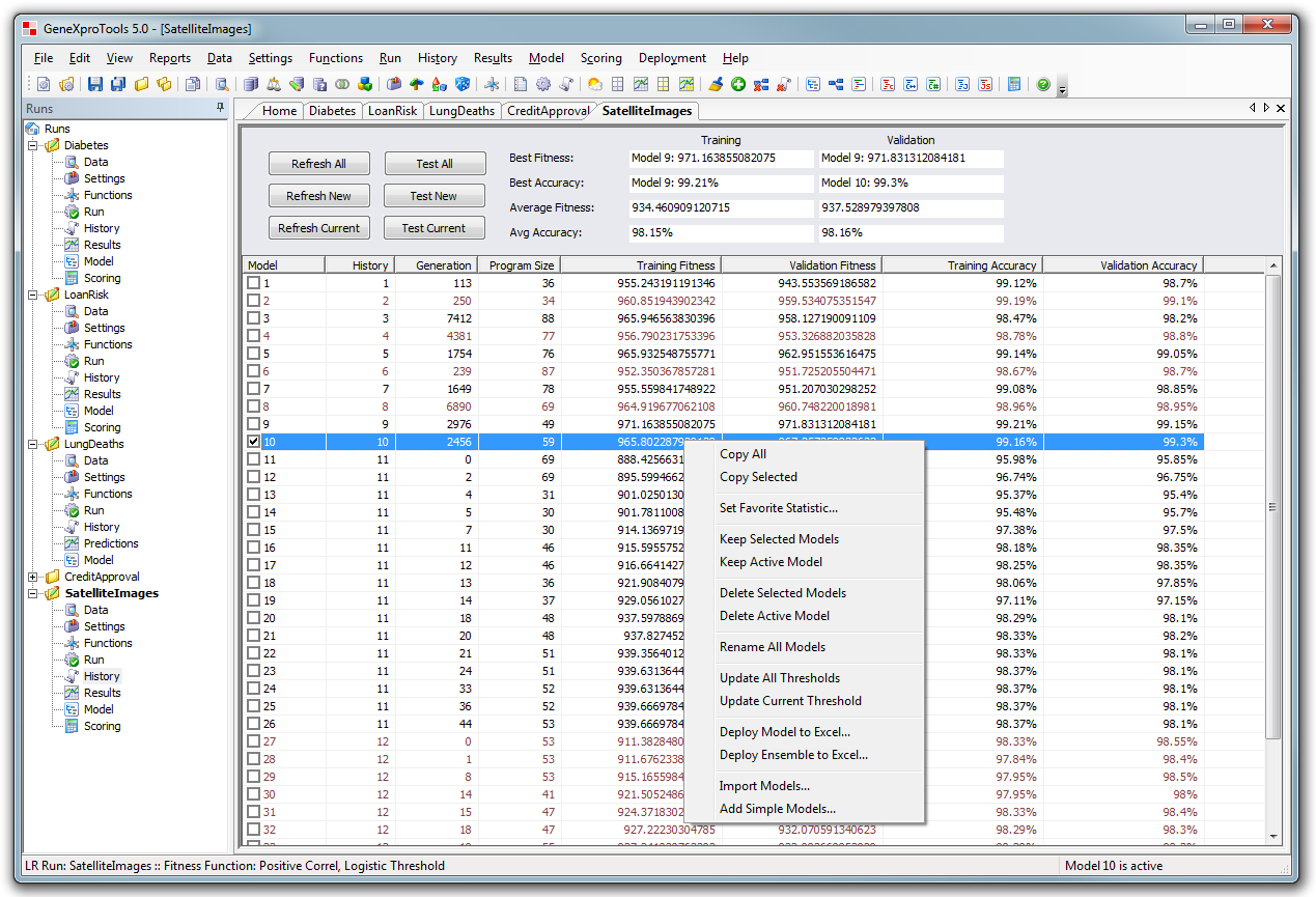
In the History Panel your models can be tested, sorted, deployed to Excel or deleted.
|
|
Model Panel
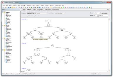
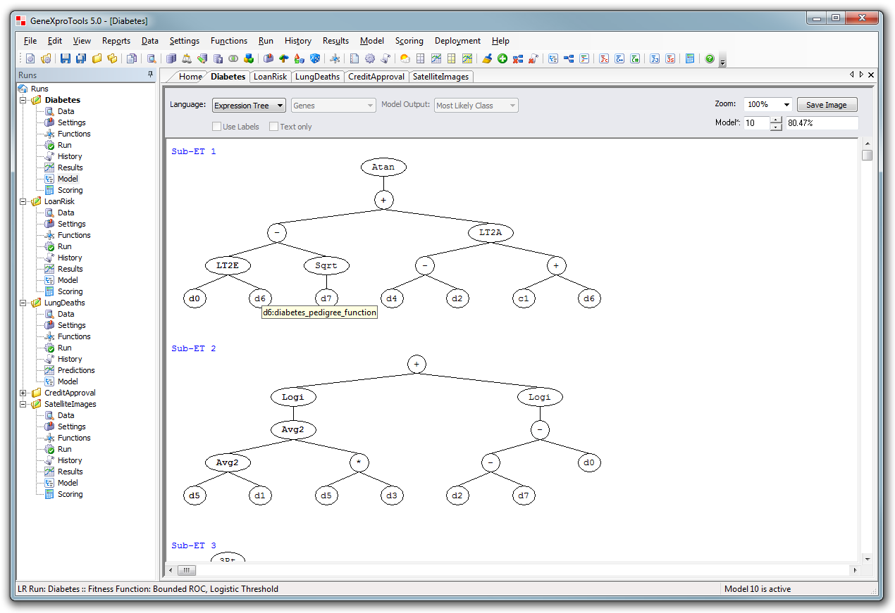
Graphical model visualization using Expression Trees,
now with tooltips over each node.
|
|
Model Panel
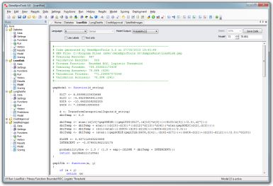
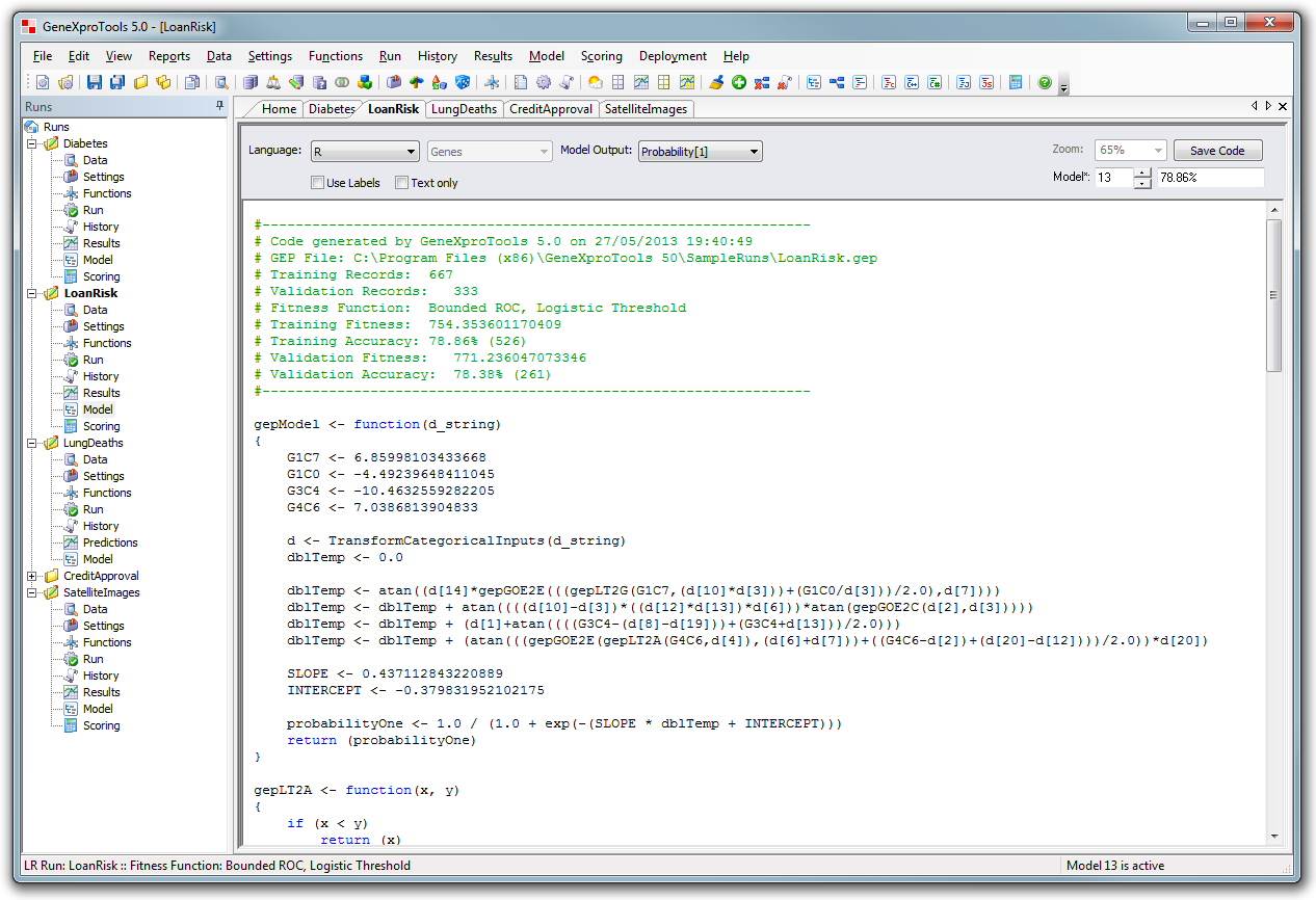
Translate any model to 19 different programming languages, including
R, Matlab, Octave, Python, C++, C#, Java, Visual
Basic, VB.Net, Perl, PHP, etc.
|
|
Scoring Panel
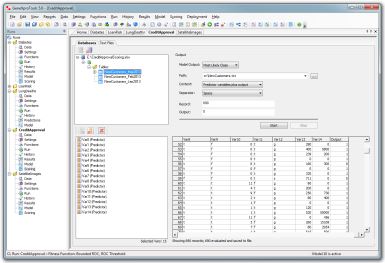
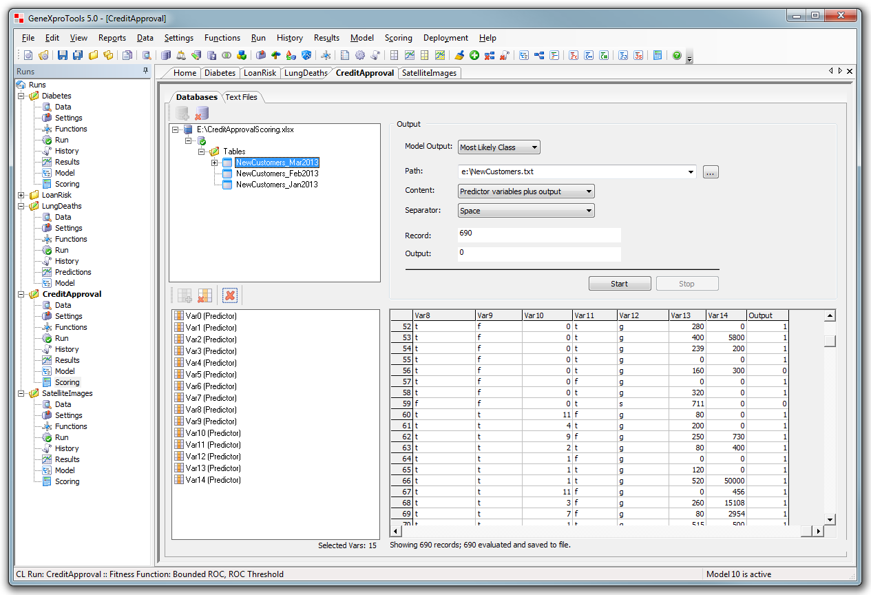
Easy model scoring within GeneXproTools with a convenient snapshot of the first
2000 records.
|
|



 Home
Home About Us
 Contact
 What's New